Everything has its own timely trends, may it be on fashion, news, music, and even videos we see on streaming and social networking sites. Each country has its own fashion trend depending on the season, and videos now are getting viral thanks to YouTube and Facebook. However, no matter how popular one trend has become, there will come a time that these trends will be labeled as ‘old-fashioned’ or outdated. New fashion style may rise or another video may get viral once people got tired of the old ones. New musicians will appear and some people’s taste in music may change over the course of time. This is the reality – the bottom line is trends do come and go. Some last longer if patronized by many and some unfortunately don’t even last for a month.
Trends in Other Aspects
Like what was mentioned above, not only fashion, music, and news have trends. In the world wide web, website platforms offer different website design for users. The thing is certain designs have become so well-liked that people use that as their pattern or template, resulting in the rise of popularity of said design. And since we have turned another chapter, let’s bid farewell to some things that should be left in 2017, and welcome what’s in for us this 2018 including, yes, web designs.
Trends for 2018
The year 2018 just started and for sure, lots of new web design trends will come out even before we reach the midyear. Some designs that got famous before and became outdated might once again come out with twists.
Listed below are some of the web design trends in 2018 that you may try to spice up your website.
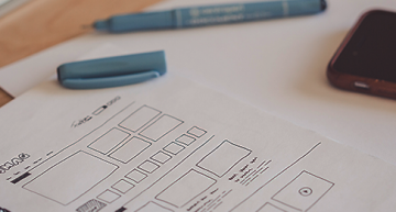
Minimal Design
Some minimalist designs include simple animations which are pleasing to see. These designs also appear clean because of the numerous blank space, so your website visitors will focus on the content. Minimal web designs are especially ideal for those who are new to web developing or website managing for a much easier maintenance, but this can also be used by advanced website owners if they want to showcase their contents. Additionally, big bold typography for titles can be catchy for your visitors, as they would already have an idea what your content is all about just by seeing the title text on your website.


Typography
With the development of many typefaces available today, you may choose from thousands of them to use for your website. Back then, people use popular typeface from media like movie titles as spoofs for their printed products. Free typefaces, or the ones we typically see as font options in software, can be improvised to make it appear innovative and stylish. For example, a combination of a typeface and a photo creates a deep and dramatic impression; the text gives the viewers’ an idea of what the image wants to say. This not only emphasizes the content, but it also adds aesthetic to the content of a website.
Illustrations and Videos
People are getting hooked on visiting websites that exhibit photos and videos, which some labeled as “memes”. On the more professional side, using videos for tutorials rather than explaining them through plain step-by-step text allows you to visualize the content so your visitors would have a clear idea how to do a particular activity. The same applies for using photos as it can summarize your website’s content. Illustrations come in different shapes; you may use still-life or 2-dimensional photos. Online sellers prove their credibility through the use of their products’ photos and demos. After all, a picture is worth a thousand words. Also, using customized photos gives a more personal touch to your contents rather than using stock photos as the latter may reduce the quality and originality of your website.

Mobile-friendly
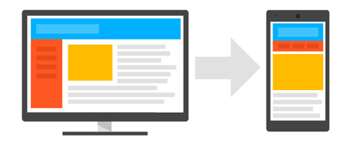
The domination of smartphones today has made an impact on web designing. Because most people use mobile phones than laptops or desktops, many developers likewise established separate designs for different platforms like Android or Apple. Common and unresponsive designs become a hassle for users as some needed the zoom in and out feature, and most of the time, the entire view of the website appears convoluted. On the other hand, if a website has developed its own application or simply created a responsive design, the website would be accessible with a great interface and fully functional features even from mobile phones.
E-commerce
Most people, if not all, build websites today for the sole purpose of business. One reason for this is the large audience and potential customers they may target, since internet is widely used by many. Another reason is that the use of websites brings out a lot of possibilities (and features), unlike doing business in a physical office building. This is why website platforms such as WordPress develop plugins like WooCommerce. This makes it easier for business owners to do their work and reduce the time and money they spend. It also gives customers convenience since they won’t need to go out to purchase goods; their orders are ready with just a click.


Cinemagraphs, GIFS, and Animations
If you are presenting a tutorial, you may use animations and gif files as an alternative for videos since the latter take time to load most of the time, especially when you have internet connection issues. Additionally, a long loading time can bore your visitors, which may result in them looking for other websites. To make this more effective, you may create gifs out of the videos with online gif makers or software. Although creating gifs takes time, this in return avoids the inconvenience of website visitors may encounter when waiting for a video to load. After one part of the gif file has been uploaded, you may then proceed to add the text which contains info on the tutorial.
Chatbots and Artificial Intelligence
Chatbots and AIs are now used as contact and support for businesses. This kind of virtual support can be made easily without spending so much time and money. Another great thing about bots is that they also serve as a personal assistant. Hotel owners can use bots as personal assistants if in case visitors have inquiries regarding the management. Some chatbot services are offered in different language, so if a business is operated internationally, there wouldn’t be problems with foreign clients. Bots are also useful in there is a task that needs to be done on a regular basis. For example, a client buys something from your online store. The bot then may send a notification or report about this.


Grid Layouts
This layout has been trendy not only with websites, but also people who creates personal blog posts. Beginning with Pinterest, we now usually see this layout used by website owners and bloggers when their content is mostly composed of images. The photos come in different sizes so they appear organized at once, unlike the usual layout when you have to scroll down to see the next posts. Using this is also a great way for showing your visitors the summary of your posts. This saves your website a huge amount of space from having lots of text.
Infinite Scroll
It is great for websites that want to have users staying for a longer period of time and those that is frequently updated. Because new posts and contents appear at the bottom, there is a big possibility that visitors would get hooked, and therefore stay longer than usual. Additionally, having an infinite scroll can the visitors time from clicking the ‘next’ button and waiting for the page to fully load. You can also go back at the top of the page just by scrolling up in case you want to look again at the first few posts. Likewise, this feature needs no use for the ‘previous’ button.


Horizontal Scroll
It gives your website a different look from the rest since usually, they are scrolled vertically. Websites which can be scrolled horizontally gives an effect like a book. Furthermore, you may create a separate design for the next “page”, so it gives you a different appearance when you scroll onto the following page. You may also have a different section for each page to divide your contents. For example, the first page contains the introduction about your business, you may put the products and/or services you offer on the next slide. Then the third one may have the information about you and your employees.
Icons
Icons have been widely used in any types of website, may it be on social networking or simple blog sites. It has been used to reduce the blandness of a website from having too much text alone and can save space when you use icons rather than textual descriptions of a website feature.
![]()
These are only some of the web design trends that will make noise this year. For sure at some point, some of these would be out of style again, so while it is still hot, it’s better to use this opportunity to be on what’s “in” today.
